Pickle
Patch
Acres
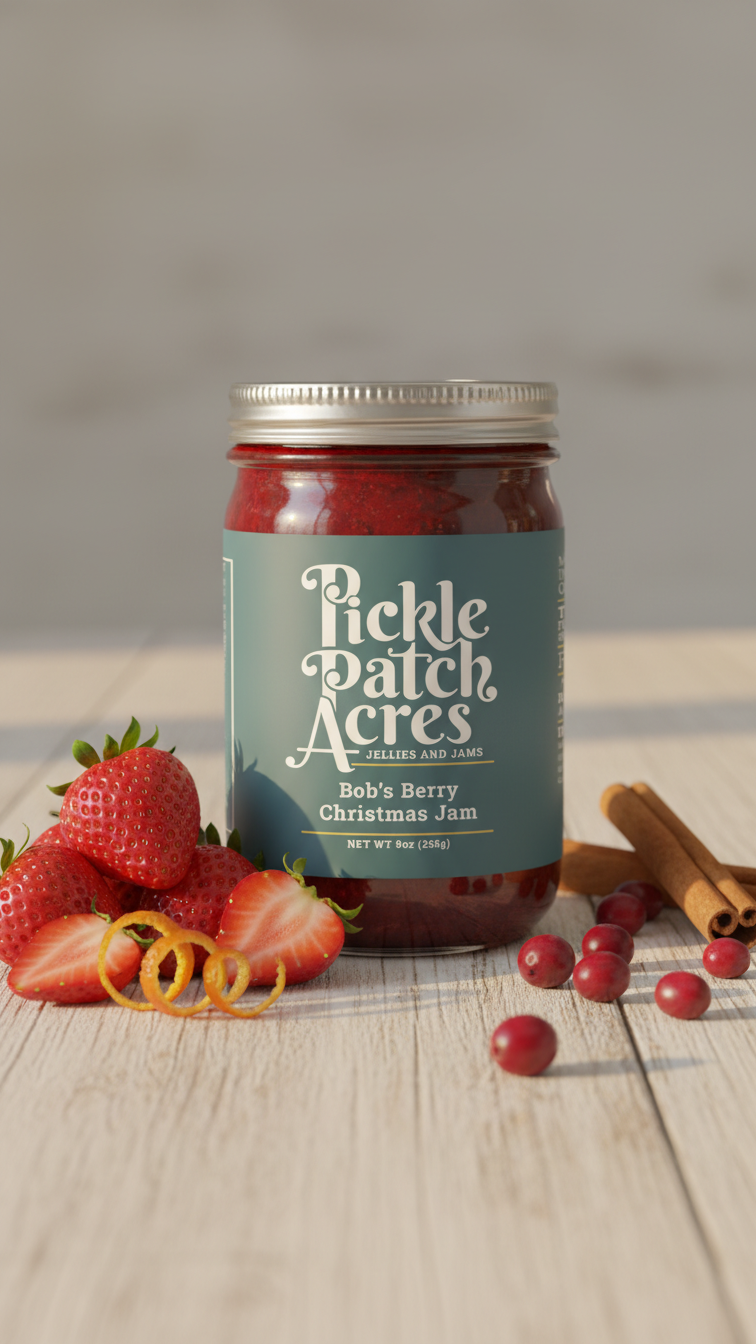
Problem
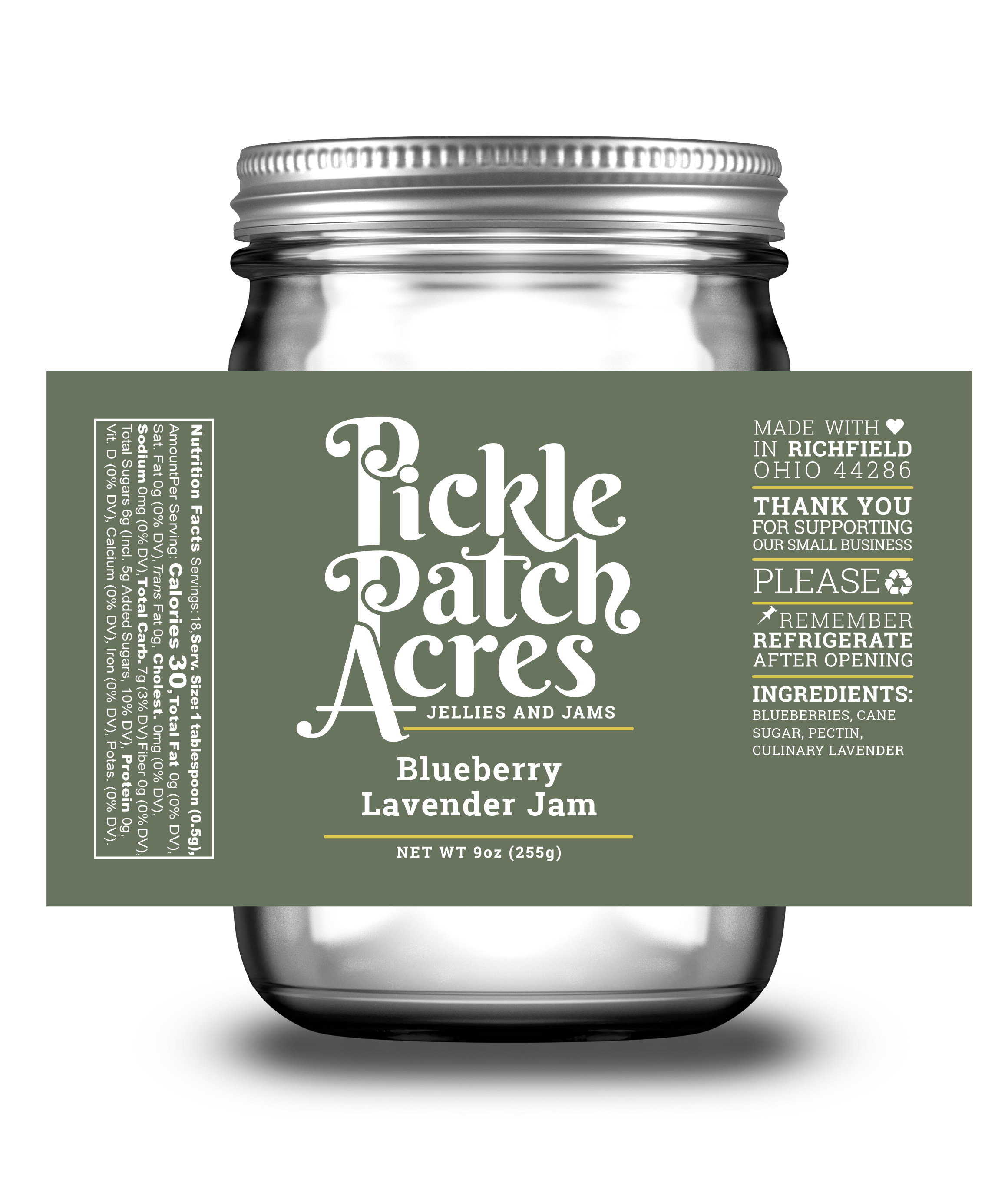
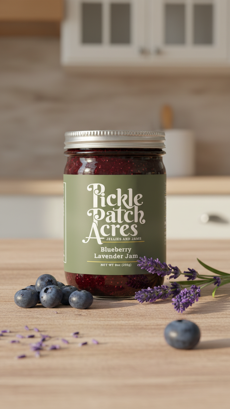
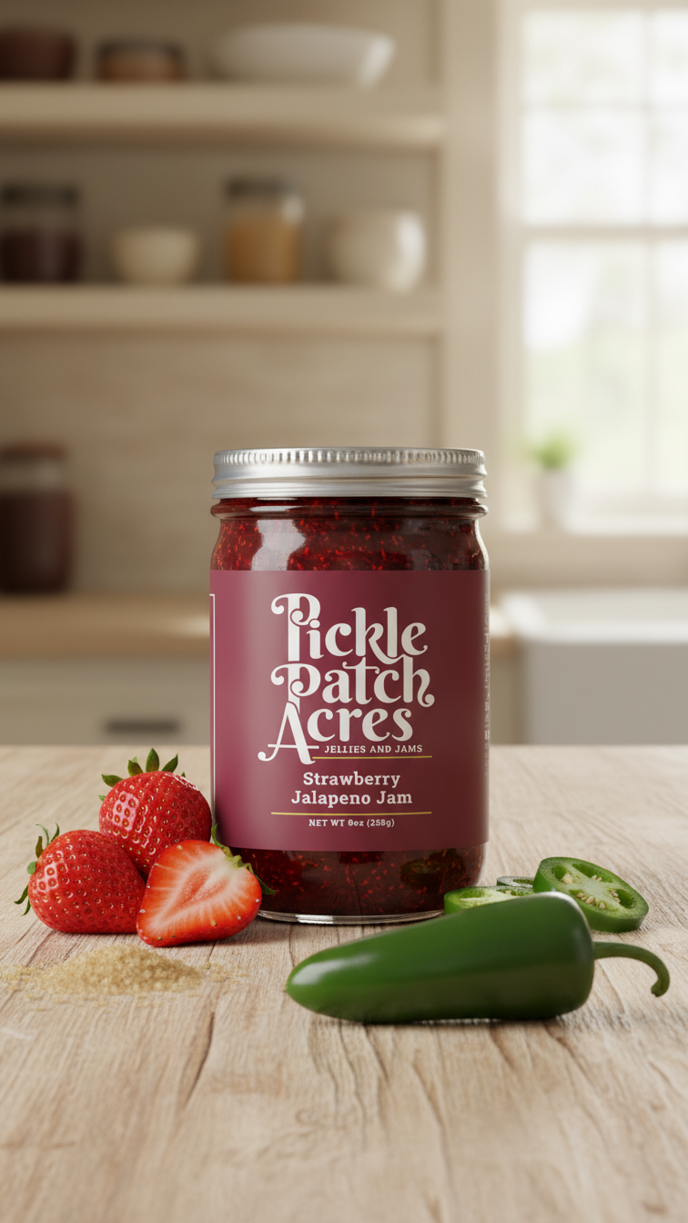
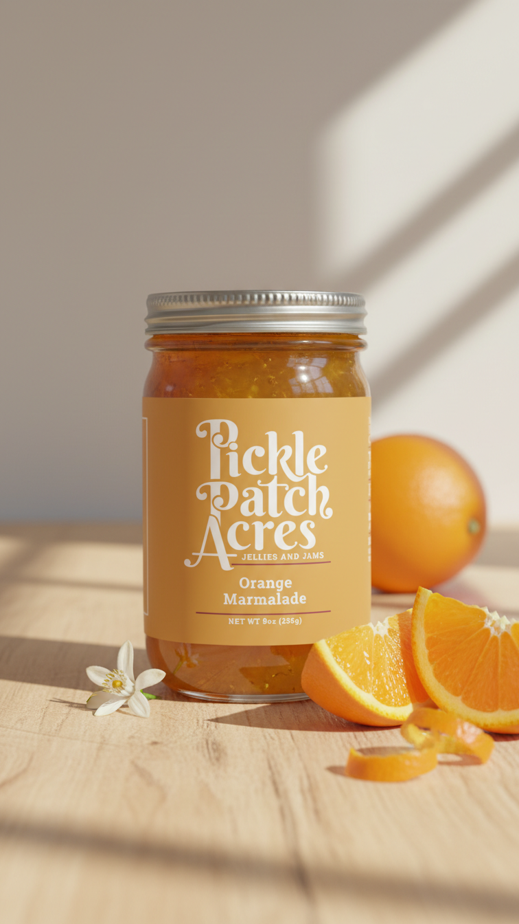
A local jamery needed a brand refresh and label redesign that could scale across its full product range while helping customers tell products apart at a glance on shelf.
Solution
Created a new wordmark and a color-coded system as the backbone of the design: red for spicy varieties, green for herb-based blends, yellow for marmalades, and blue for fruit jams. For small-batch and seasonal releases, I also designed a clean, blank template for handwritten labels, preserving authenticity within the broader system.
Outcome
A refreshed, intuitive, and visually unified identity that elevated the brand while improving product recognition and shelf impact.