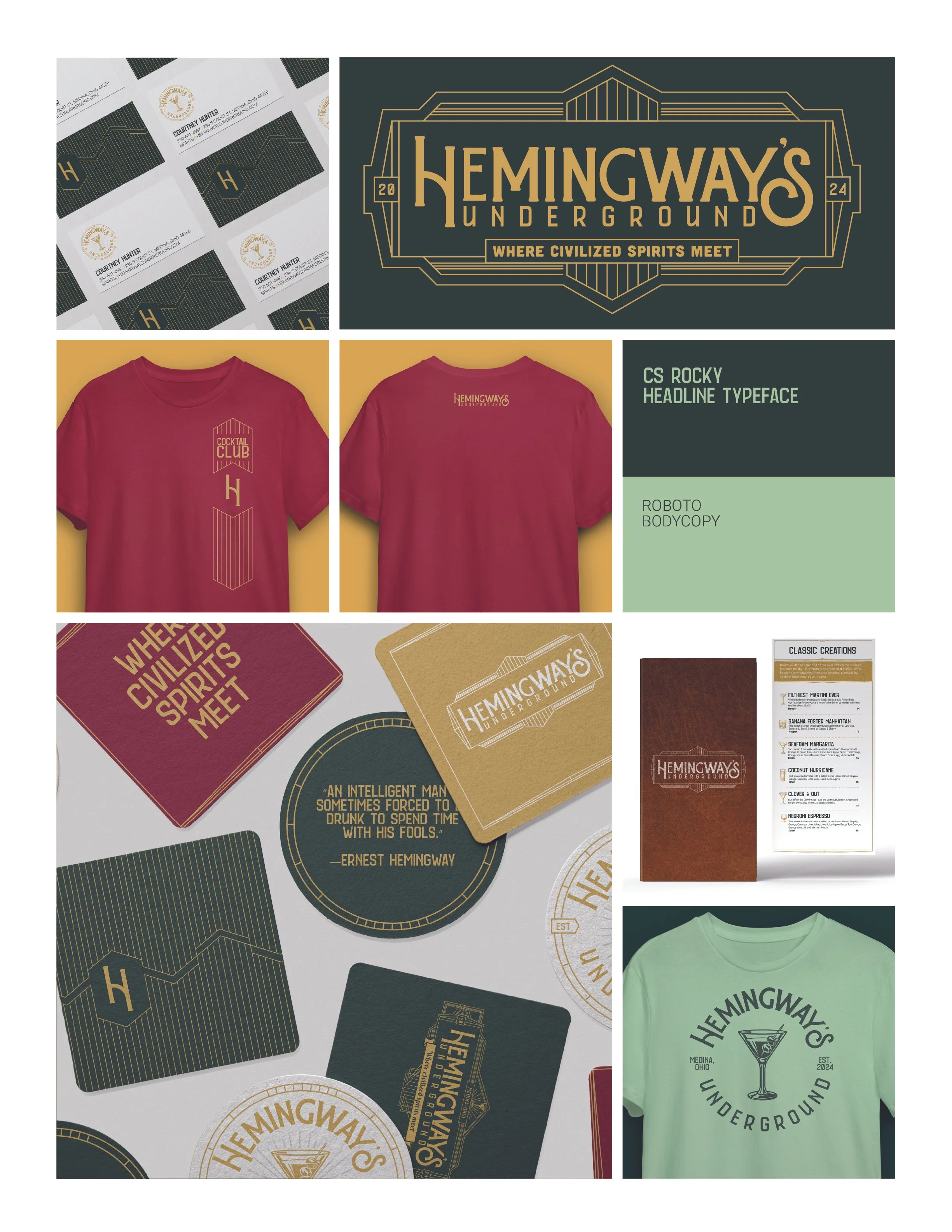
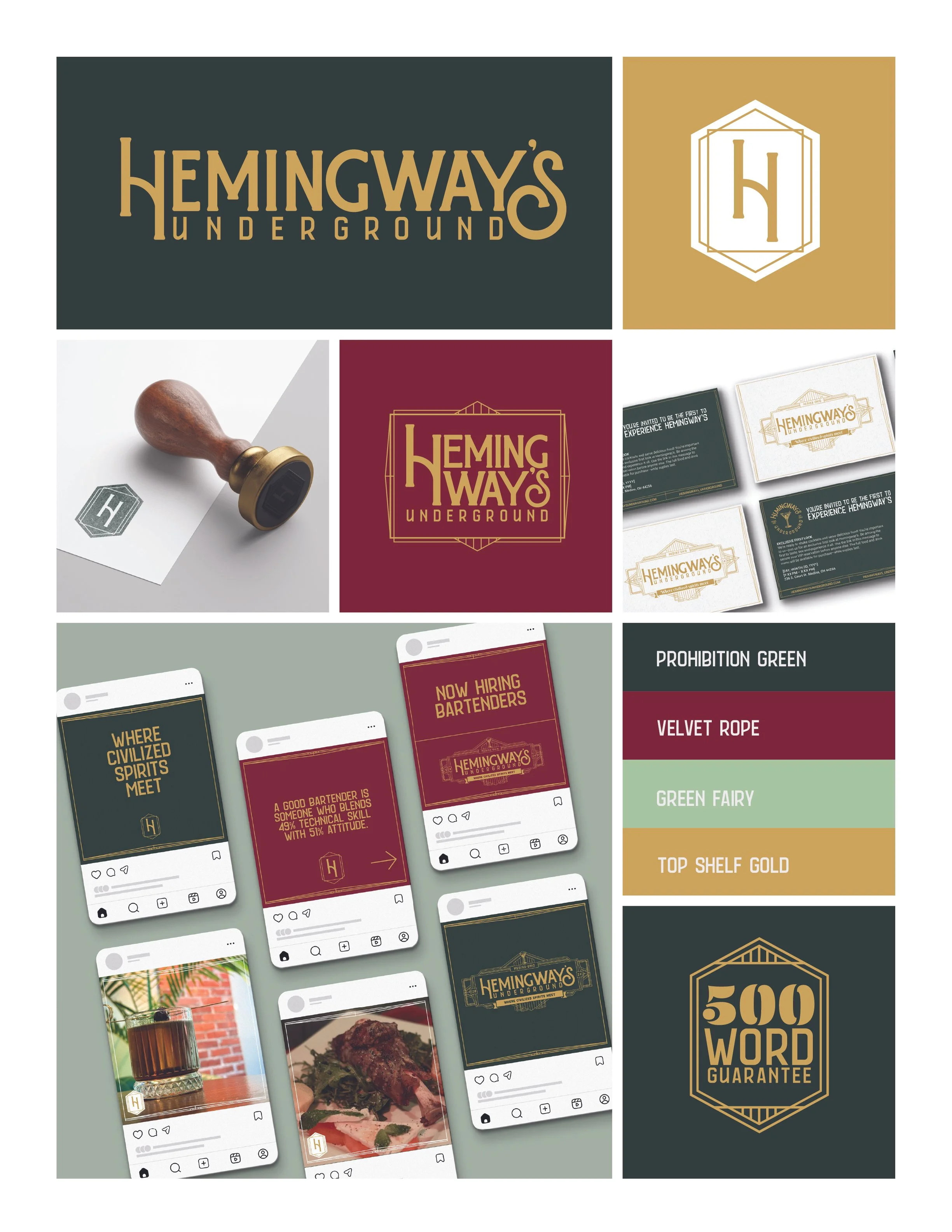
Hemingway’s Underground
Branding system, wordmark, logotype, marketing material,
Hemingway's Underground is a high-end speakeasy operating beneath street level — a destination for guests who expect every detail to be considered. The existing brand communicated nothing about the experience waiting downstairs.
The challenge was to build an identity that honored the venue's architectural reality, its literal descent from the street, while projecting the elevated, art deco sophistication the owners had curated inside.
The central insight of the brand system lives in a pair of directional marks that do double duty as symbol and metaphor. An upward arrow signals the upscale, elevated experience — aspirational, refined, above. A downward arrow acknowledges the speakeasy's underground address — a descent into something rare and intentionally hidden from the street.
Together, they create a tension that is the venue's personality: the descent is deliberate. Going below is the point.
The arrow system and scalable frame gave the client a design language they could grow into: flexible enough for new menu offerings and seasonal collateral, disciplined enough to remain unmistakably theirs.